OVERVIEW
For This project I had to redesign the Finchingfield Lavender Farm website and try and remove some of the flaws and friction within the website making it easier to book and view the website.
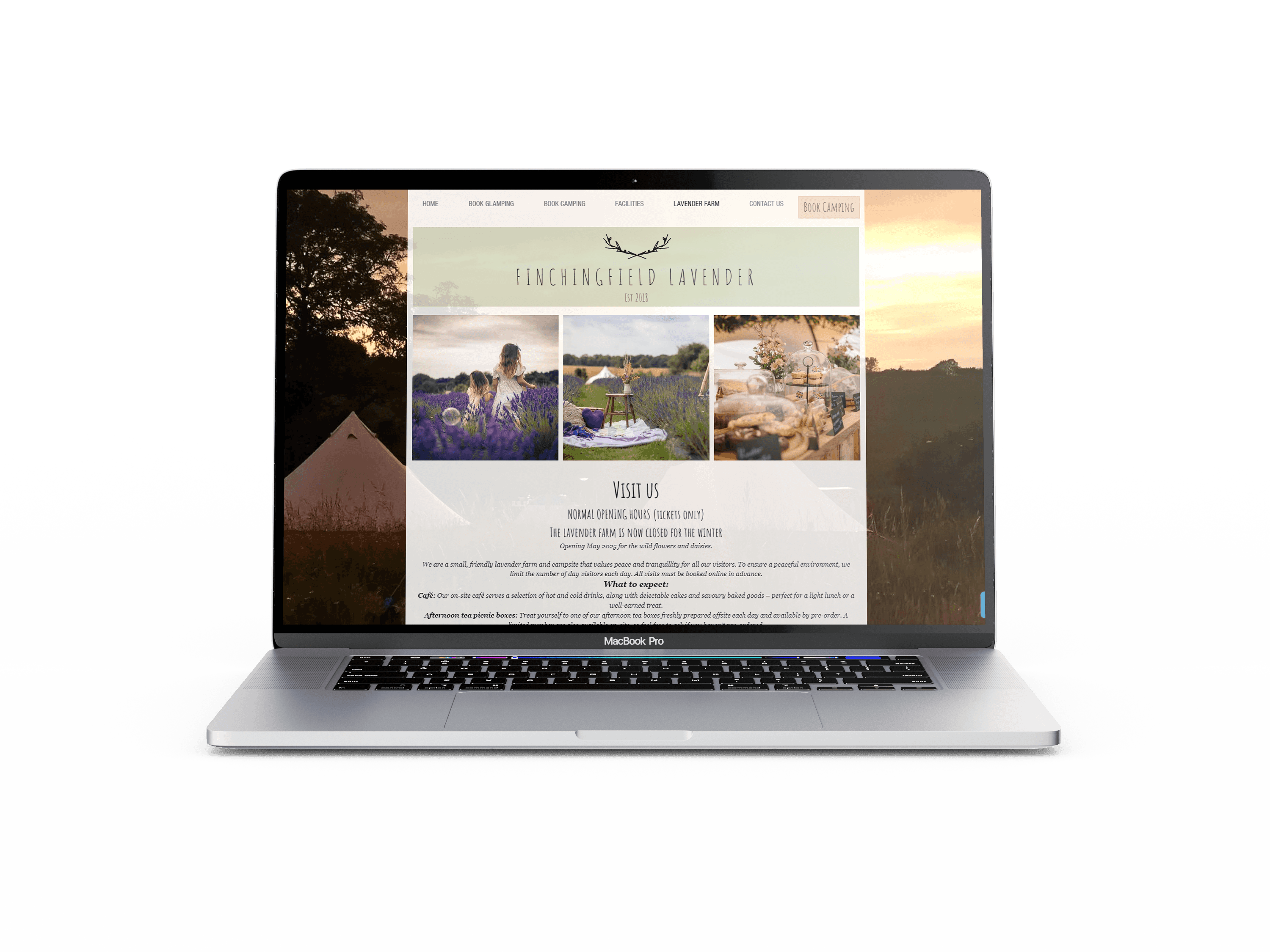
I didn't like the image they used at the back and during my user test someone commented it was just a distraction and was pixelated so wasn't very ascetic either
Design
The website had lots of issues through certain stages of the booking process it would look like a different website this can cause distrust in customers and make them think it is a scam or a bad product also there were a lot of bloated features in the website that diddn’t actually seem to do anything slowing down the website and possibly confusing the user

Finchingfield Lavender Farm

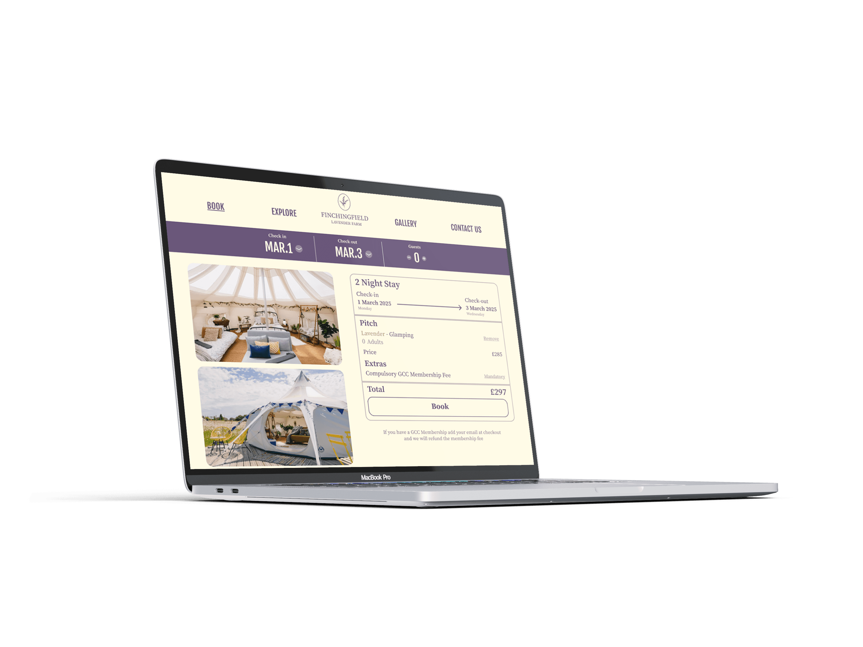
My designs for the booking system to make it easier to use and more user friendly making sure to display the most important information first and using hierarchy to display all info as best as possible
PROBLEM STATEMENT
I wanted to simplify the menu and give it a better colour theme because the current website had a different colour scheme on every page so it was confusing and un ascetic I wanted the booking system to be front and centre then photos and information were under the fold on the page and anything important was right at the top. I also made the menu much easier to read and I took out some font so there were only 2 across the website rather than the 6 used before